“I can’t help it, being so crazy, the thoughts that come into my mind,” apologises Frank Gehry.
The man many call one of the world’s greatest living architects talked about his love of Don Quixote and Alice in Wonderland after the launch of his first Australian building, described by the Governor-General Sir Peter Cosgrove as the “most beautiful squashed brown bag I’ve ever seen”. I fell in love with this building while on holiday in Sydney.

Frank Gehry-designed Dr Chau Chak Wing of the UTS. Photo Designer’s Atelier
“The world we live in, people have got to go through the looking glass constantly. You feel like you are in the middle of a Mad Hatter’s tea party. The only thing that is real is being unreal,” says Gehry.
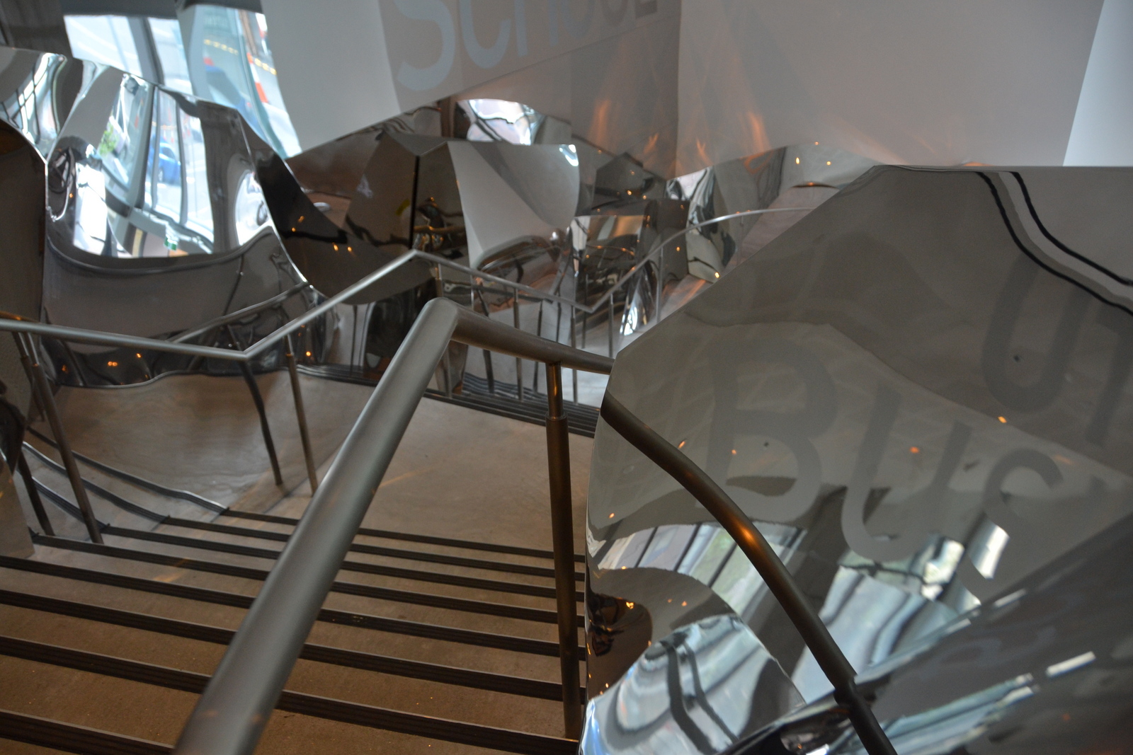
Inside the Frank Gehry-designed Dr Chau Chak Wing of the UTS. Photo Designer’s Atelier
A father’s love for his son and that son’s admiration of the great architect was the genesis of a $25 million gift by Australian-Chinese billionaire businessman Dr Chau Chak Wing who contributed to Sydney’s first Gehry building.
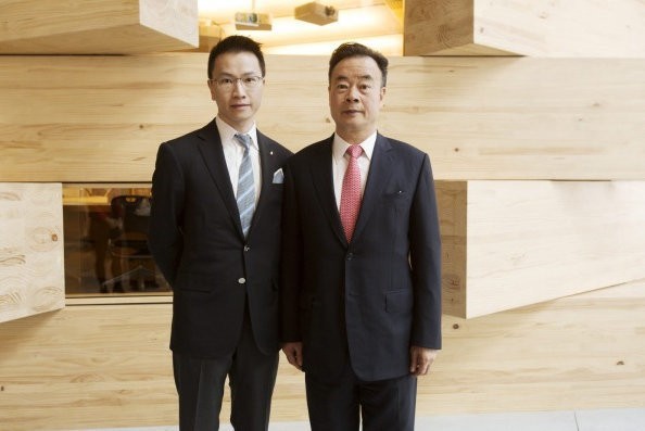
Dr Chau Chak with his son Eric. Photo James Brickwood
85-year-old Canadian Jew born Frank Owen Goldberg was anything but an overnight success. He first ruffled feathers when he transformed his own Santa Monica home in California. He was 50 years of age at the time. Until then, he had been building relatively conventional modern buildings. Unable to afford expensive materials, he enclosed his beach bungalow in a glass box in a way that some loved, and many of his neighbours hated. The risky design brought him to the attention of those who also wanted to try something new. Using inexpensive materials he started experimenting with curves, chain mail, corrugated iron and other building scraps.
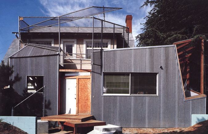
Frank Gehry Residence Santa Monica
The idea for the $180 million Dr Chau Chak Wing Building at the University of Technology Sydney (UTS) came to Gehry after a 2009 visit to see the old Dairy Farmers site in a grungy part of Ultimo. Describing his vision, Gehry wrote to the dean of the business school Roy Green back in 2009: “Thinking of it as a tree house came tripping out of my head on the spur of the moment,” he wrote. He wanted a growing learning organism with many branches of thought for learning and reflecting, some robust and some ephemeral and delicate.
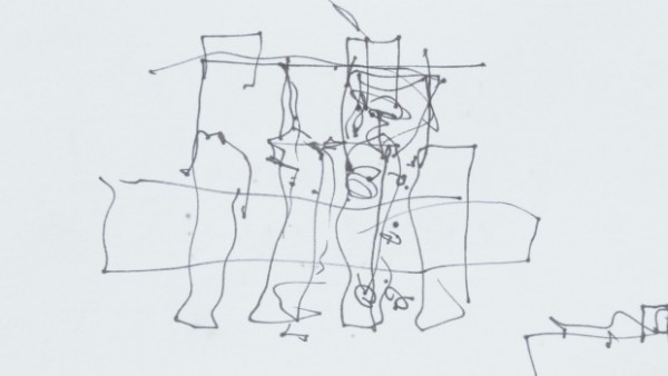
Stroke of genius. The quick sketch that arhitect Frank Gehry drew of the proposed UTS building in Ultimo. Photo Louise Kennerley
Over the past five years Gehry’s squiggle has been developed, expanded, tested and modelled in the architect’s headquarters, where as many as 150 wooden and paper models on different scales were built. The final models’ curves and lines were then turned into 3D designs using software originally developed by aviation company Dassault Systèmes to build planes.

A model of the UTS business school designed by Frank Gehry. Photo Designer’s Atelier
Gehry wanted the building to emphasise the need to “create artistry” in business education, according to UTS business school dean Roy Green. “I want to push their creative spirit (which they all have) to the forefront. Trust your intuitions based on a solid knowledge foundation. You will soar”.
Success has given him the freedom to be picky about his clients: “When I am offered a job with a corporate client, when I am not dealing with a chief, but the lower echelons, I refuse … because the outcome is going to be terrible.” “I have to become part of their dreams, their hopes. It gives me a starting place. It is a trust thing. To become part of their family, the friendship lasts.”
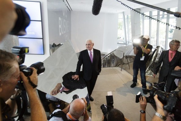
Frank Gehry at the UTS building opening. Photo James Brickwood
So who is Frank Gehry? Like Don Quixote, he defies categorisation. He is the man who gives critics the finger. Responding to criticism that he is more interested in window-dressing and making a splash – his critics often claim he puts form over function – Gehry grins like a kid, and lifts his middle finger in the American one-finger signal. “I tell them go inside, see how it works, I don’t have to tell anyone,” he says.

Architect Frank Gehry was in Oviedo to collect the Prince of Asturias prize. Photograph J l Cereijido EPA
It is hard to put Gehry into a box. He doesn’t dislike straight lines but he says he is driven to use curves and folds to humanise modern buildings. “Most of the buildings that get built are just boxes.” Of Sydney, he says, “most of the 19th century buildings are still the most accessible; they have humanity about them, while the modern buildings tend to be cold and off-putting”. Then comes a great Mad Hatter moment: “I am talking about the lifelessness of them, the inhumanness of it. It is like those movies where people put silver balls in the eyes, and they walk around with silver balls. All the buildings have the silver balls in their eyes [the windows] they don’t have a sense of invitation or humanity.”

Frank Gehry-designed Dr Chau Chak Wing of the UTS. Photo Designer’s Atelier
Instead of old-fashioned Harvard-style auditoriums and large offices dominated by faculty, the building encourages a more egalitarian and collegiate approach to learning. The two new oval-shaped classrooms encourage the lecturer to become part of the student body, while the 120-seat style theatre is designed so that two rows of desks and chairs are on the same level to encourage students to work together in small groups.

Inside the Frank Gehry-designed Dr Chau Chak Wing of the UTS. Photo Designers Atelier

Inside the Frank Gehry-designed Dr Chau Chak Wing of the UTS. Photo Designers Atelier

Inside the Frank Gehry-designed Dr Chau Chak Wing of the UTS. Photo Designers Atelier
The interior reflects the latest thinking about how students learn, with smaller classrooms and more open-plan spaces.
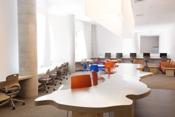
Inside the Frank Gehry-designed Dr Chau Chak Wing of the UTS

Frank Gehry-designed Dr Chau Chak Wing of the UTS. Photo Designer’s Atelier
Instead, there are smaller classrooms and more work spaces, lounges and kitchens where students can meet and (hopefully) study. “Anything that can be taught online should be,” Professor Alexander said. The more intimate spaces were better configured for interacting with teachers, collaborating with peers and ‘high-touch’ learning,” she said.

Inside the Frank Gehry-designed Dr Chau Chak Wing of the UTS. Photo Designer’s Atelier
“This was a building that has been designed from the inside out,” Professor Green said. “It starts not from the flamboyance of the architecture…but from the functionality of the spaces.”
UTS hopes the interior will be so attractive that students won’t want to leave. Well, they definitely got Sebastian’s attention as he did not want to leave after discovering he could see four versions of himself.
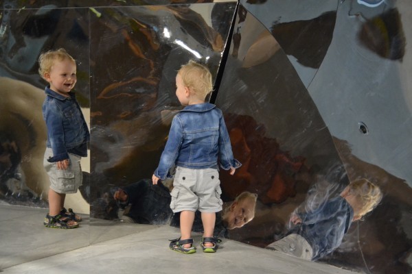
Inside the Frank Gehry-designed Dr Chau Chak Wing of the UTS. Photo Designer’s Atelier
I fell in love with the sculptural staircase at the entrance but for most Sydney siders it is the building’s striking exterior – said to resemble a crumpled paper bag – that will inspire a study tour.

Dagmar Holub Inside the Frank Gehry-designed Dr Chau Chak Wing of the UTS. Photo Designer’s Atelier
Five types of brick sourced from Bowral were custom-made for the project, containing a continuous groove rather than a typical indent. Stainless steel bars were inserted through the groove, bolting the 320,000 bricks to steel frames that form the graceful, undulating facade.

The brick facade of the new UTS Gehry building. Photo Dominic Lorrimer
The atypical design made construction a slow, painstaking task, with bricks laying perhaps 100 bricks a day rather than their usual 500.
When the building appeared to lack something, Gehry famously squeezed its middle, something that is reflected in the buckled waist of the structure’s undulating walls comprising 320,000 bricks which were each laid by hand. It was this facade that created the biggest challenges, said Patrick Woods, UTS deputy vice chancellor (resources).

Frank Gehry-designed Dr Chau Chak Wing of the UTS. Photo Designer’s Atelier
“The glass side had its challenges, but the bricks, we looked at it, and thought we have no idea how to do that,” said Mr Woods. “It’s trademark Gehry. He designs and then we work it out.” And making it work took multiple consulting firms, he said.

Frank Gehry-designed Dr Chau Chak Wing of the UTS. Photo Designer’s Atelier
The man with the reputation for overblown budgets is happy the building came in on time, on budget. (The Gehry team says this reputation is undeserved because in each case there were factors outside their control.) Contrary to claims that the new building was expensive, senior UTS sources say it cost only a fraction more per square metre than another building of the same size – which wouldn’t have had the wow factor or the innovations. Alec Tzannes, dean of UNSW’s built environment, says Gehry has given architecture a “whole new voice” by bringing about a shift to unconventional shapes: “He made us produce buildings that are fun, sculpturally exciting, good experiences.”

Frank Gehry-designed Dr Chau Chak Wing of the UTS. Photo Designer’s Atelier
Nevertheless, Gehry appears to be as busy as ever, with huge projects such as a new Facebook campus in the works, but he admits he is handing more and more work off to his staff. At nearly 86, he is slowing physically, but Gehry’s mind remains sharp and curious.
“Question everything, be curious forever, and never forget that life is about people, so make buildings for people, and always use natural light, ’cause it is free.” Gehry once said in his note to his younger self.


